Chase Banking App Redesign
My Role:
For this project, I was the lead UX designer. I was responsible for designing the information architecture, wireframes, and conducted six rounds of usability testing.
Brief:
Chase has noticed a continuous steady decrease in activity and adoption of their existing mobile app. They want to redesign the app in order to better help alleviate financial anxieties by providing people with secure access to their finances so they can spend more time doing the things they love.
Existing information architecture
The current mobile application housed everything under a hamburger menu making functions and features difficult for users to find.
New information architecture
The redesigned information architecture allows the user to navigate the application with more ease and less confusion. Through the tab bar they are able to access core functions with less steps.
Existing Home View
The previously designed Chase mobile banking app housed all critical functions within the hamburger menu. Users had to open the hamburger menu and scroll up and down the list to find needed features. Notifications and essential alerts such as missed payments are hidden.
redesigned Home View
The redesigned home view welcomes the user and allows them to quickly find the function or information they were looking for. Important alerts or notifications are immediately identified on the home screen.
USABILITY TESTING
I wanted to understand how real users would think and interact with the interface as they moved through each flow. Where are the biggest hang-ups? I intercepted strangers at coffee shops and conducted usability tests using the Think Aloud Protocol. I went through 6 rounds of testing and iterating on the key flows. Here were some of my findings and solutions.
new WIREFRAMES + Work flows
hi Fidelity comps // Deposit a Check
Additional process documents
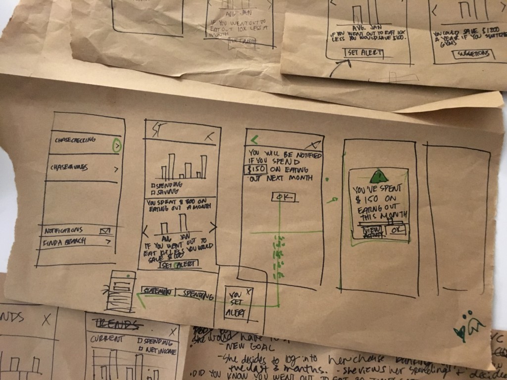
Story Boarding + Sketching
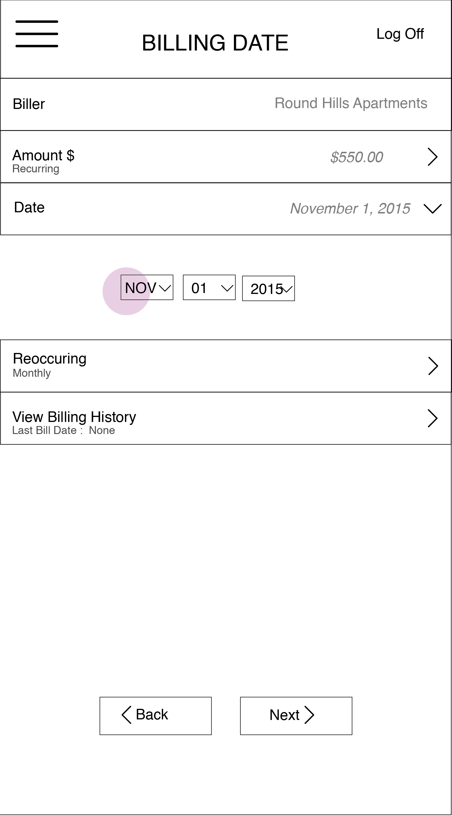
Low Fidelity Wire Frames
Based on the sketches, I developed low fidelity wireframes for initial user testing and ideation. Low-fidelity colorless wireframes are important to get ideas and concepts across without distraction. Here is the initial wireframes for the adding a bill flow.
ROLE:
Lead UX Designer
TOOLS:
Sketch App, Illustrator, and InVision


