Service Design:
Butler Pitch & Putt
Butler Pitch & Putt, a classic Austin hidden gem, risks loosing it’s place if it is unable to attract and keep new customers.
BUTLER PARK PITCH & PUTT SCOPE:
Problem: After decades of serving the city of Austin, the owner, Lee noticed a drastic decrease in new customers. She knows Butler Pitch & Putt risks losing their place in Austin if they are unable to attract and keep new customers.
We spoke to customers (regulars and first timers), staff, and the owner to get a deep understanding of the opportunties to make Buttler Park Pitch & Putt an even greater experience.
Here’s what we found:
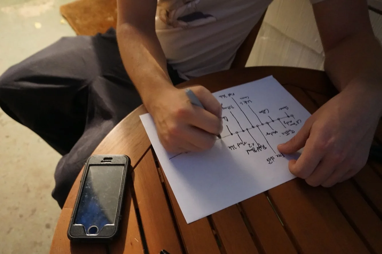
Ideal Customer Journey Map : What the owner thought was happening.
Click image to enlarge
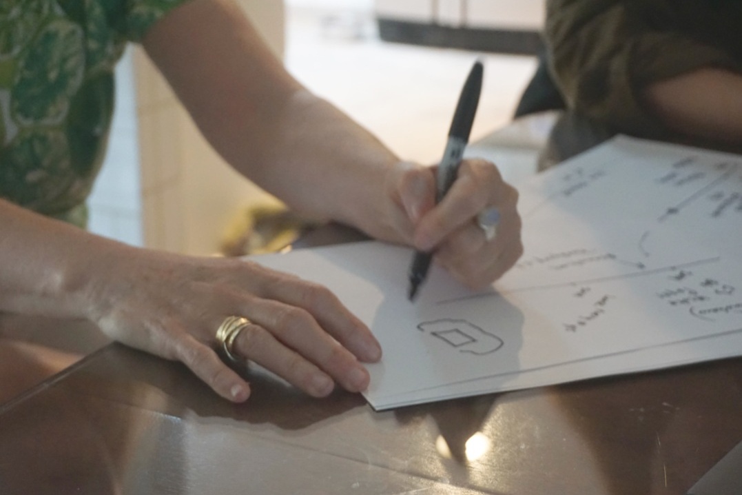
Actual Customer Journey: What was actually happening.
Click image to enlarge
Problem:
Butler Pitch & Putt risks losing their place in Austin if they are unable to attract and keep new customers. New customers are afraid to look ignorant and rely on touch-points and staff to anticipate their needs. When staff doesn’t offer guidance and touch points fail, new patrons don’t ask and remain ignorant.
Our design criteria:
Seamlessly integrates with Butler Pitch & Putt landscape
Adoptable by long-time Butler Pitch & Putt staff, regulars and first time patrons
Maintains old South Austin charm of Butler Pitch & Putt
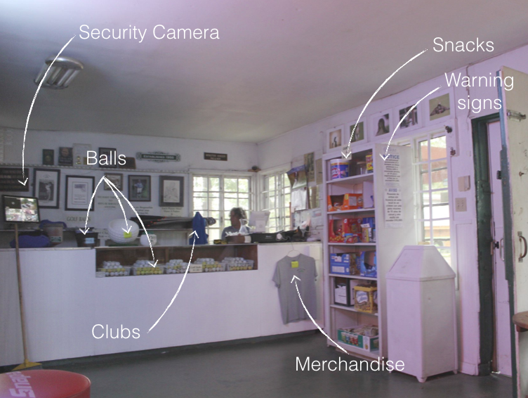
painpoint one : club house
“Is anyone in here? What do I need? How do i start?”
Our Goal: Create an Inviting Clubhouse where first timers experience confidence not confusion.
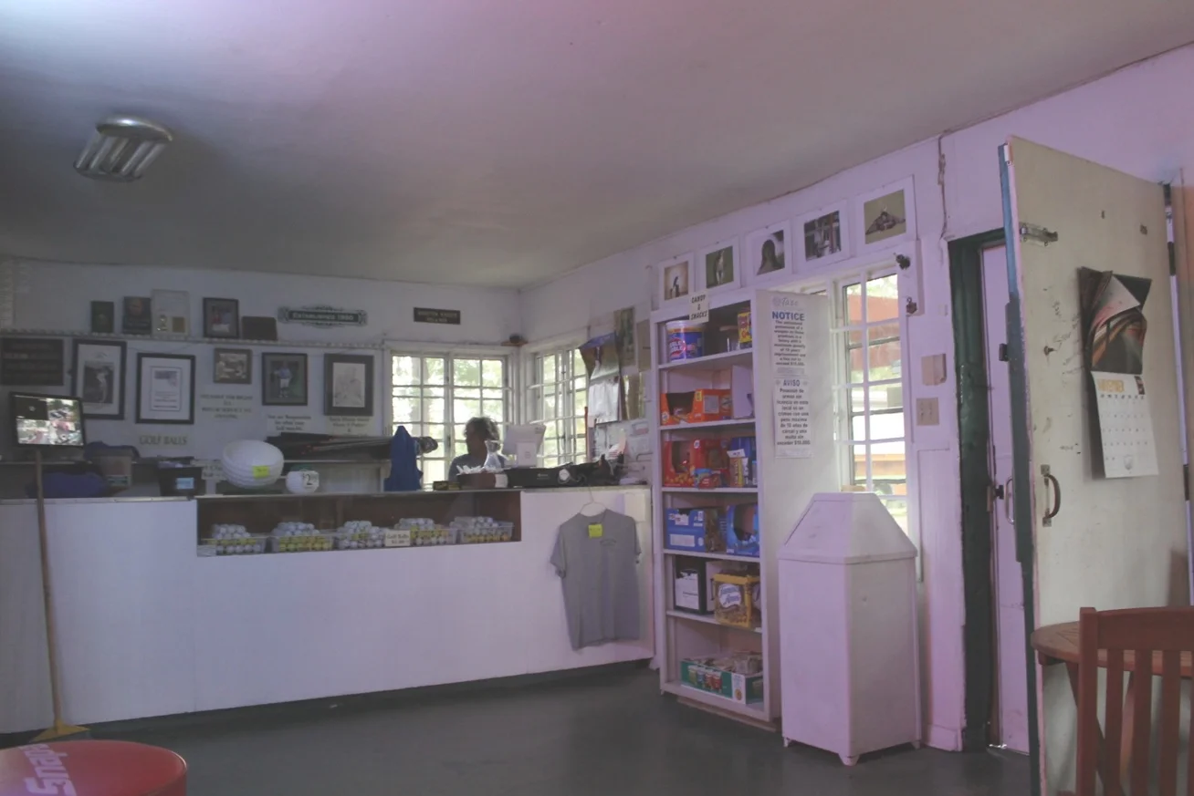
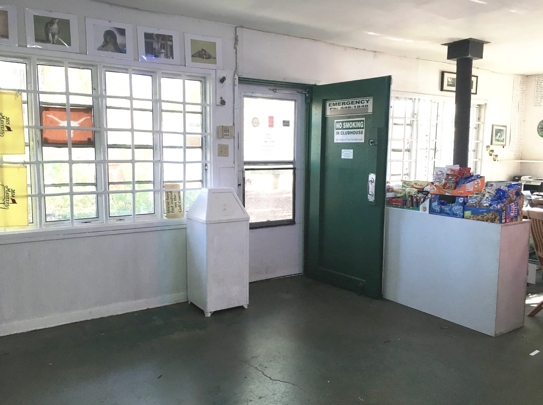
BEFORE:
“They just stand there and look at you like you’re supposed to read their mind.”
“That’s one thing I noticed about a lot of people, they don’t read... They don’t look at signs.”
Proposal:
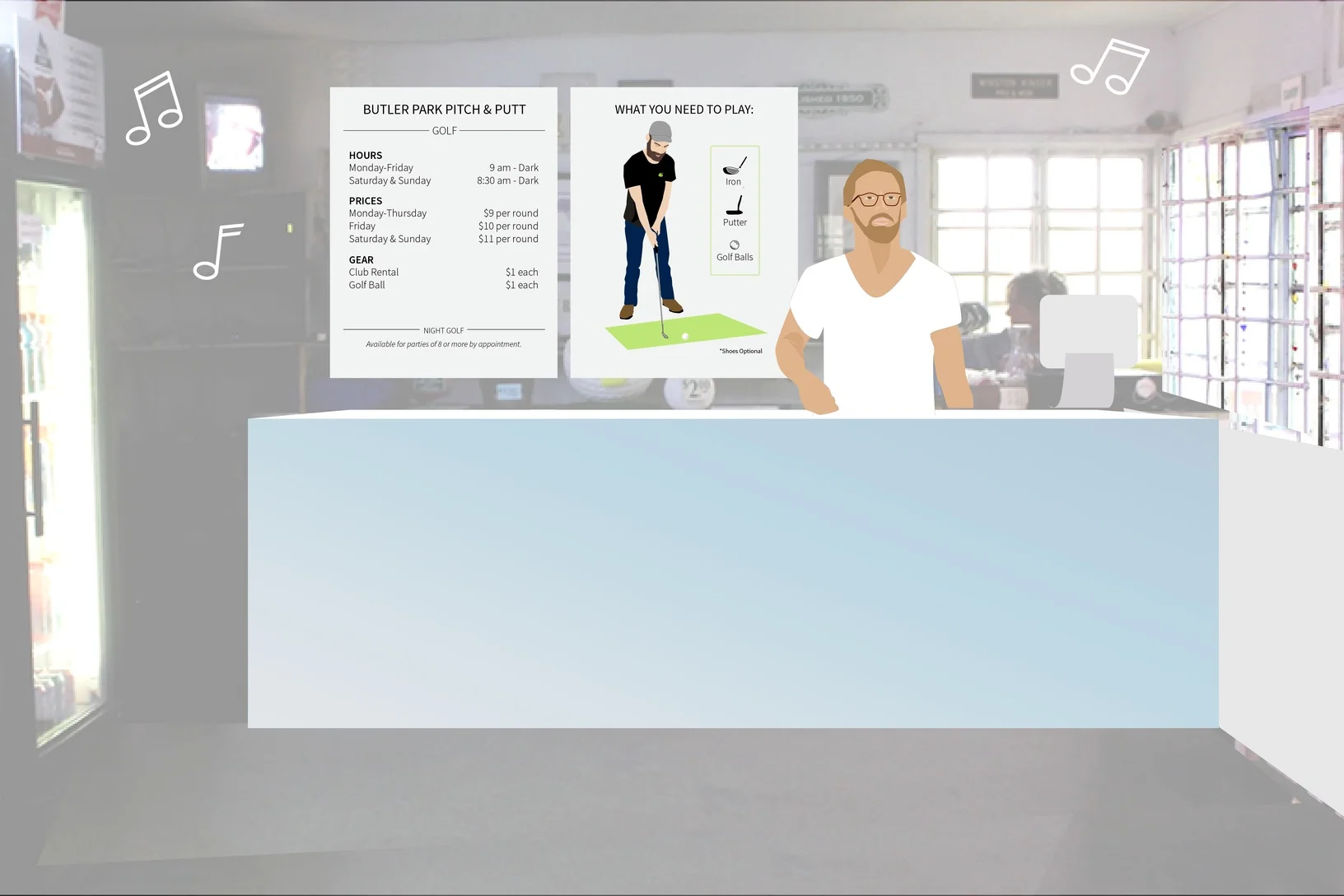
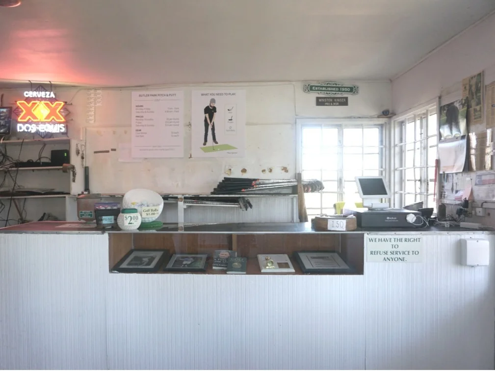
Create clear signage and remove unnecessary clutter from behind and on the counter.
Remove everything from back wall and display the cherished memorabilia inside of the counter.
Rearrange the space so the staff aren’t hidden behind the book shelf. We found many first-timers walk in with confusion.
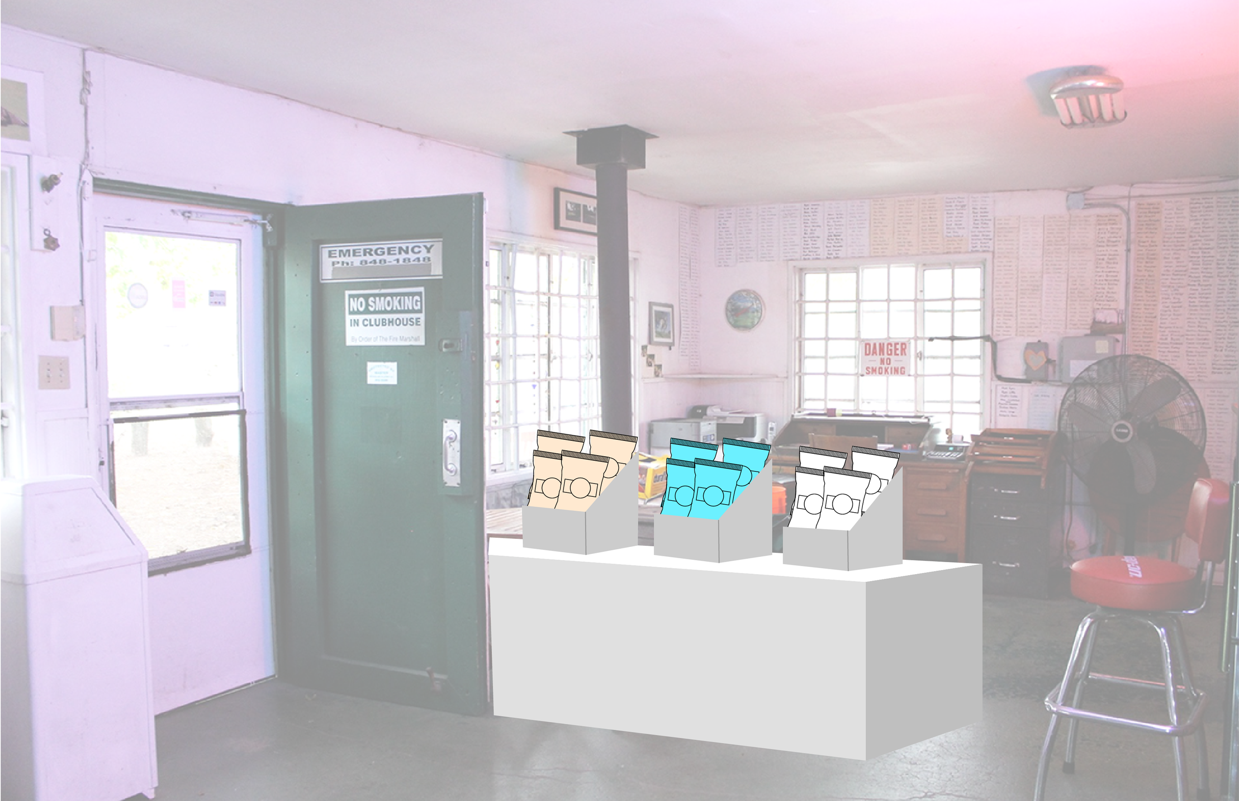
Move the book shelf so first time customers could see the countertop, the staff member, and let more light into the space. Many first time customers mentioned they didn’t notice refreshments being available. We had a hunch a better placement would change their sales.
prototype implementation:
Results:
We watched first time customers walk in and know immediately what they needed. Additionally, within the first week, the owner reported sales for merchandise and refreshments had increased.
“I need to be that guy ”
pain point two: finding the first tee
where in the world is the first tee?
Goal: Create Easy Independent Navigation
Before:
“I’m sure we are wrong [about the next tee box]. Here, you want to look at this? I’m all spun around on it.
”
Proposal:
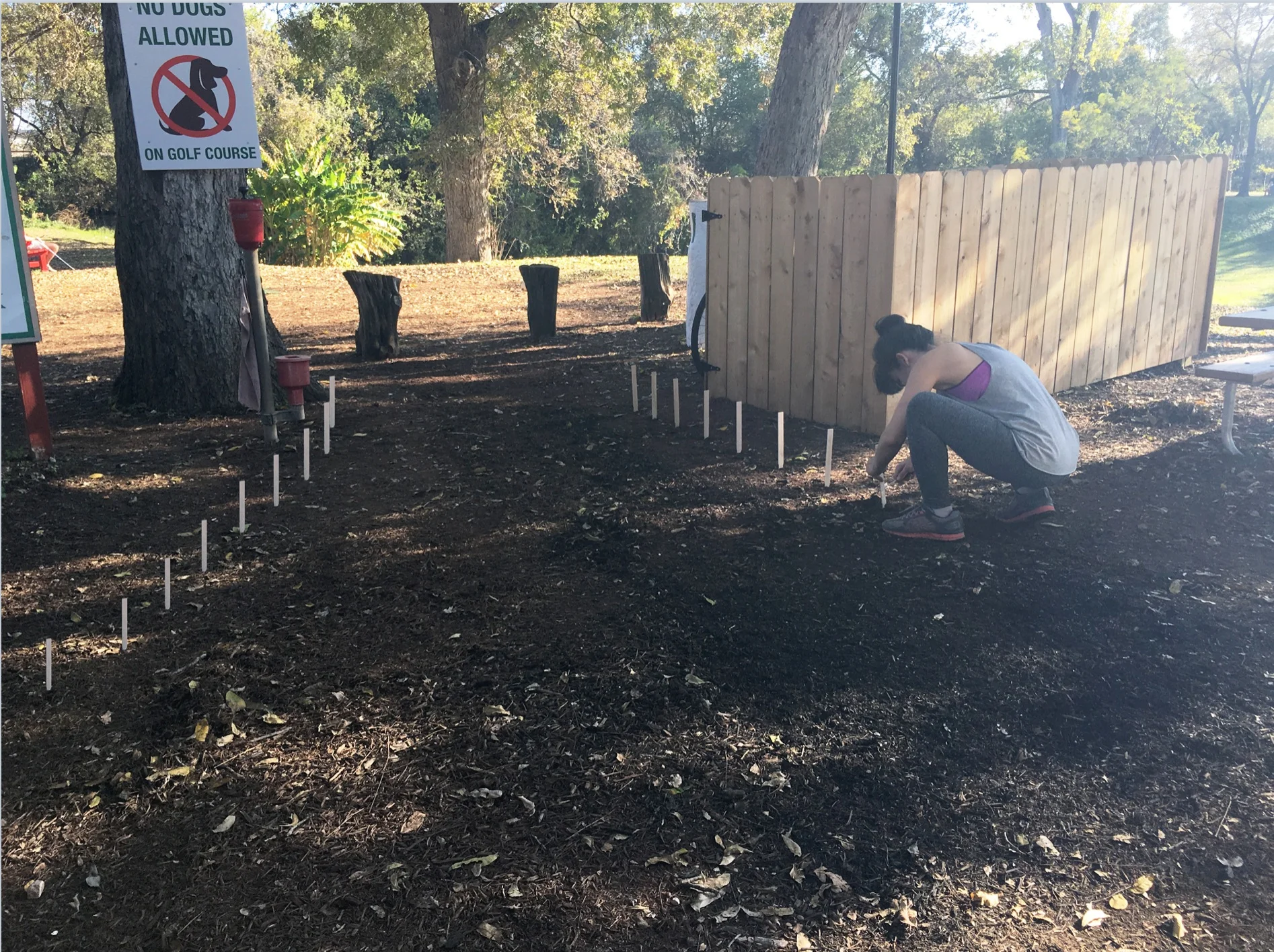
Change the flooring to create a natural pathway to the first tee upon exiting the clubhouse.
prototype implementation:
We used sticks to test out the concept before they invested in a more permanent solution.
Results:
We watched first time customers walk follow the path to the first tee with ease.
painpoint three: inaccurate map
how do i read this map?
Goal: Create Easy Independent Navigation and Easy to Read Map
Before:
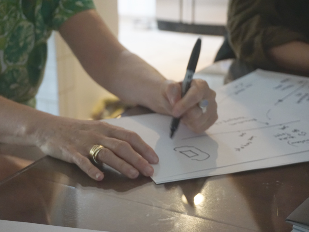
Here we had the owner go through a reflection timeline exercise and drew out her ideal customer journey and timeline at Pitch and Putt.
“I guess a lot of people don’t realize you have to turn the map upside down to read it.
”
BEFORE:
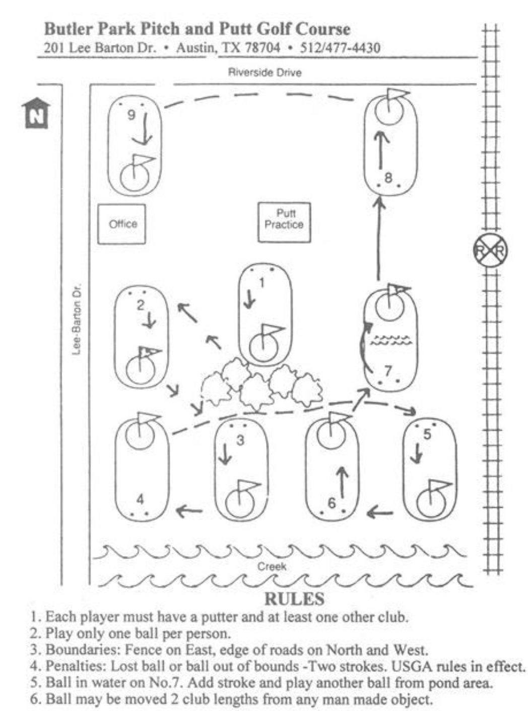
ORIGINAL MAP - As we interviewed first timers, we found the map to be confusing and inaccurate for customers. Especially since the map is upside down from the starting point, the clubhouse. We knew redesigning the map would be easy and high impact.
AFTER:
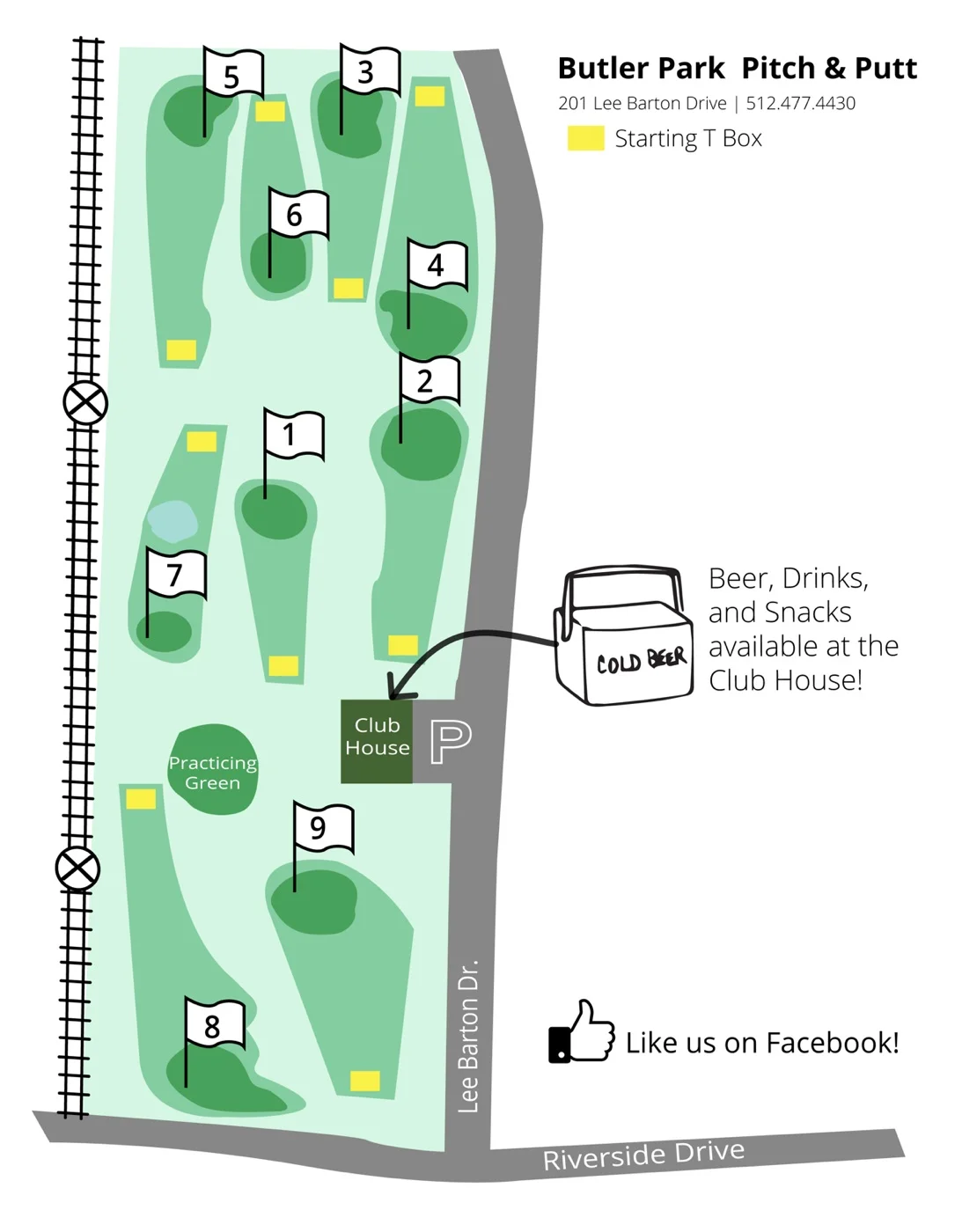
MAP REDESIGN - Our new map design was created to be easy to read from the clubhouse. Additionally, the owner mentioned the desire to grow their audience on Facebook and sales from refreshments.
RESULTS:
We interviewed and watched first timers utilize the new maps with ease and less confusion compared to the original map.
Jessica, a first-timer directed her friend group with confidence.
“It’s right there, hey y’all it’s this way!” ”
How did the prototypes work after a week?
A week after Celine, Misty, and I went back to Pitch and Putt to see the results of our prototypes. Here were some responses from the owner and staff members:
“I like it. It’s open. Right on, guys”
“At first I was like, oh, I don’t know. But, it’s good to have a fresh pair of eyes on it. I love it!
”
Celine, Misty, and I outside of Pitch and Putt during our last walk through. We had a blast working on this project during our time at AC4D.
Austin City Parks Administrator happened to be stopping by again to have the owner sign some paperwork. She checked in a few times every year and immediately noticed the difference.
““We could use you guys at all of our golf courses.”
”
This project was a part of AC4D’S 1k challenge, we were one of the few teams that did complete the challenge. Our team had a blast working on this project.
Role:
User Interviews, Ideation, Mockups, Implementation of Prototypes, Customer Journey Map Creation, and Visual Design.
Team:
Misty Nickle, Celine Tibault, and Sophie Kwok.
Tools:
Illustrator + Keynote
